Client
The University of North Carolina at Chapel Hill
The University of North Carolina at Chapel Hill
Role
Art Director, Designer
Art Director, Designer
Project Details
Prior to 2020, the UNC-Chapel Hill brand was fairly minimal, consisting only of a logo system, two typefaces, and one official color. While the brand had a great foundation, the simplicity made it difficult to produce compelling designs that were distinctly “Carolina.” This lead to the creation of many disparate designs across campus, which lacked cohesion and brand recognition. Another challenge was that, due to budgetary or other reasons, many departments could not hire my department or another professional designer. Non-designers within departments would have to create materials, but were at a disadvantage since the brand had very few elements to work with.
Prior to 2020, the UNC-Chapel Hill brand was fairly minimal, consisting only of a logo system, two typefaces, and one official color. While the brand had a great foundation, the simplicity made it difficult to produce compelling designs that were distinctly “Carolina.” This lead to the creation of many disparate designs across campus, which lacked cohesion and brand recognition. Another challenge was that, due to budgetary or other reasons, many departments could not hire my department or another professional designer. Non-designers within departments would have to create materials, but were at a disadvantage since the brand had very few elements to work with.
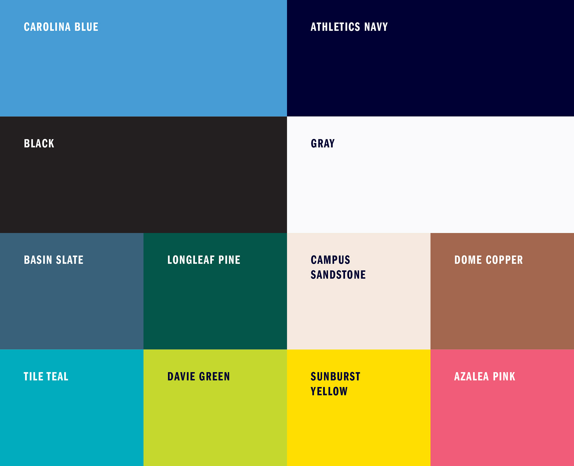
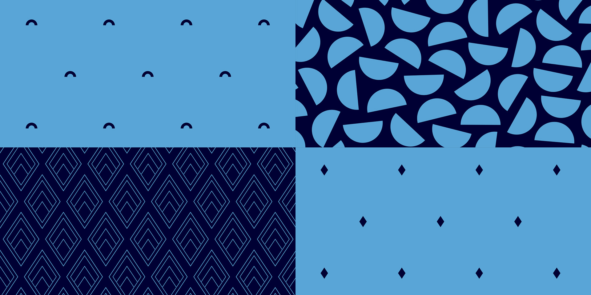
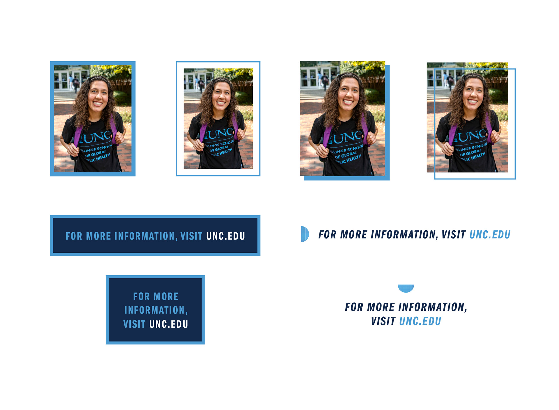
Aside from the 2017 unit logo restructure and redesign I worked on, the brand had not been altered since it was created in 2004. When the University gave my department the green light to propose a brand extension, it was a dream come true. I set out to create a suite of brand elements that would help build recognition for the University and our departments, as well as empower people to create engaging and on-brand designs that cater to a wide variety of audiences. I added an expanded color palette, new typeface, shapes, patterns, textures, background photo treatments, callout text treatments, and photo frames. Each element inspired by some aspect of campus and intentionally designed so that designs created with any combination of these elements would be reflective of the Carolina experience.
Throughout the process, I gave presentations to several groups and worked with senior leadership to get approval of the new brand elements. Once the brand went live, I hosted several learning sessions to guide employees on how to use the new elements.
This project was a Gold Award recipient in the 17th Annual Davey Awards.
Original Brand Elements

Brand Extension


Video by Melanie Busbee
Select mockups (t-shirt and shopping bag) by Andrew Jacobs